Modernising the no-BS CRM
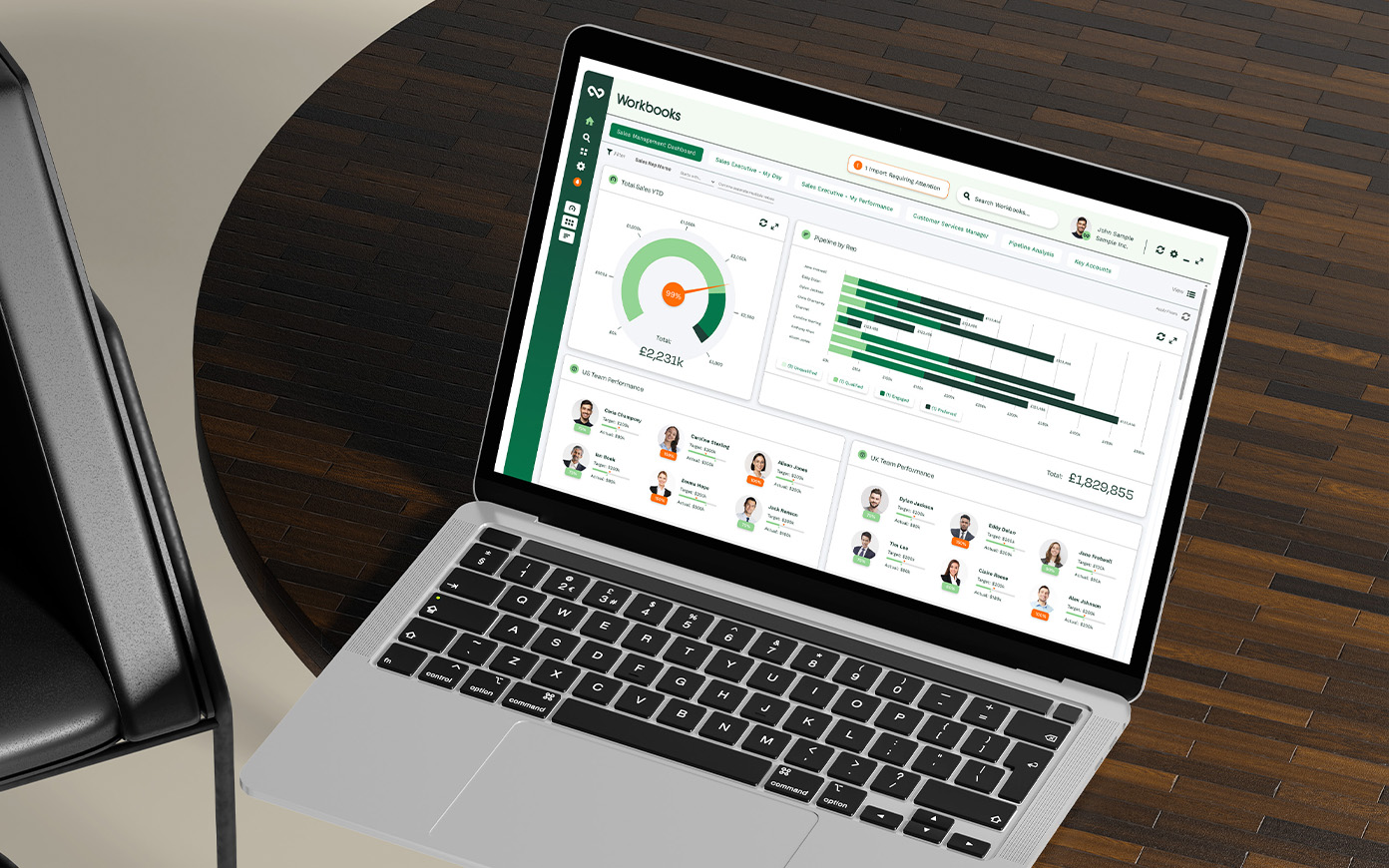
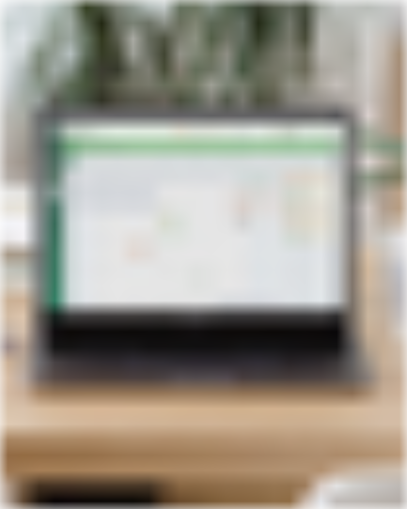
Workbooks dashboard overview designed by Mighty, brand agency

Putting data to work

The client: Workbooks

Workbooks are a CRM developer, providing an, in their words, ‘no bullsh*t’ alternative to Salesforce, Hubspot and all those SaaS platforms you see adverts for on Amazon Prime when you’re trying to catch up on the latest season of The Boys. We’d previously worked with them on some branding updates, and they wanted us to help bring their dashboards up to speed.


The Moment of Change: Waking up

Workbooks has plenty of functionality and is one of the most customisable CRMs on the market. The company boasts some big-name clients – the NHS, Domino’s Pizza, STV and so on – but their dashboard was looking seriously out of date. It was big, boxy and crammed with too much information.

When you’ve got new SaaS companies springing up every day ready to swoop in and steal your customers, it’s time to modernise, and Workbooks knew we were the team for the job.

Putting strategy to work

The Workbooks product team gave us an in-depth tour of the system and all the freedom we needed to play around in their demo account. So we did, pushing it to the limits to see what it could do and crucially, figure out what customers would want to see most.

We took the time to map out the different customer journeys and see how people would reach each element, and whether or not that journey could be improved.

Once we knew how we wanted people to navigate around the system, we got the big sheets of paper out and put our big user experience brains to work to wireframe the new look and feel. This is a crucial step – before we start making pages look nice, they’ve got to work hard for the user.

Reinventing the product

After we were happy with the wireframes, it was time to shift from analogue to digital and get everything looking sharp and streamlined.

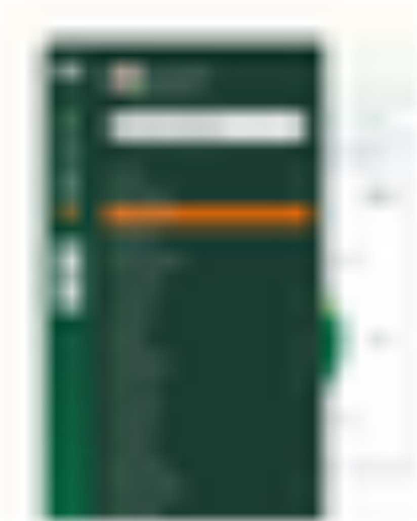
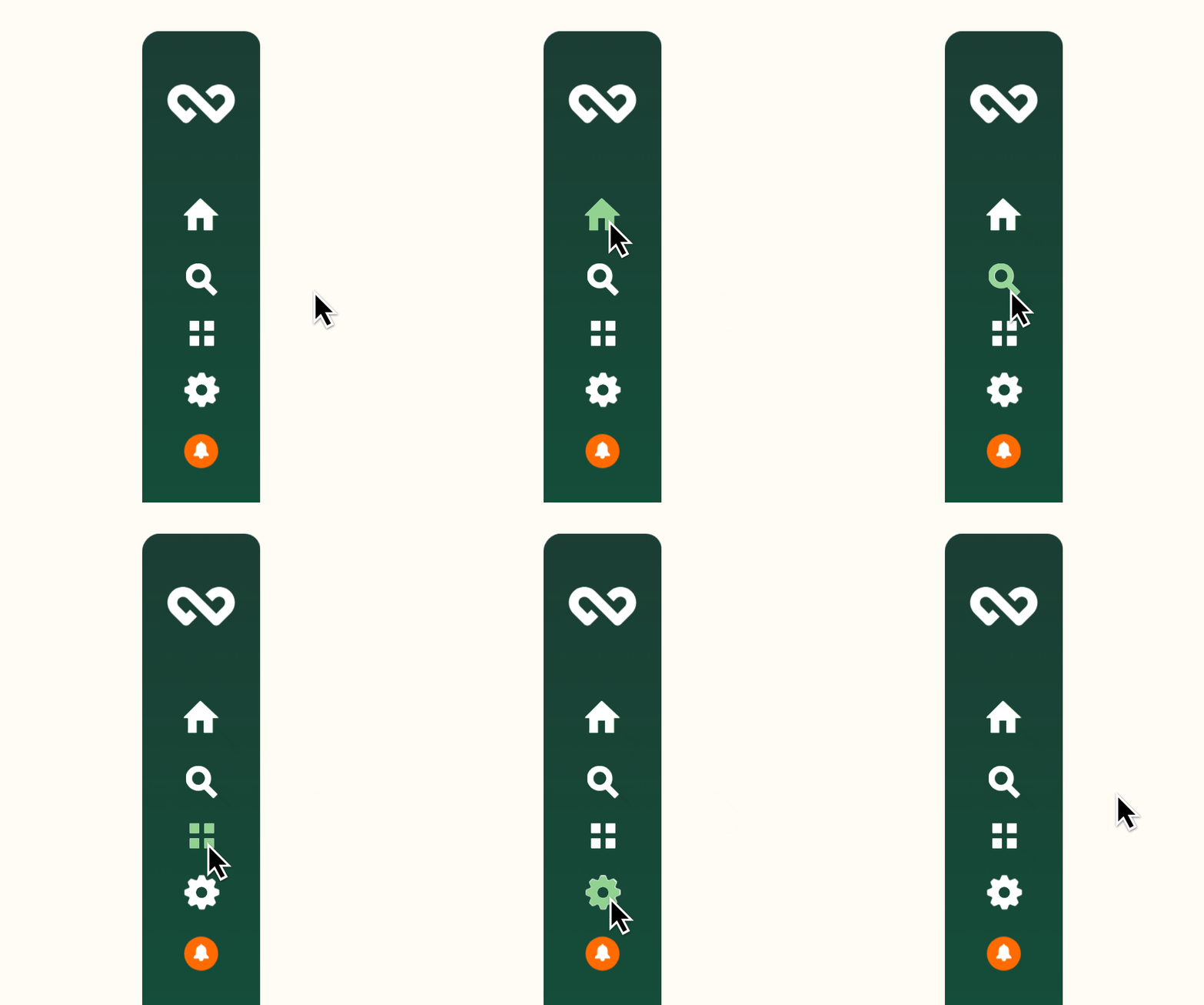
We moved Workbooks away from heavy oranges to more subtle shades that complemented the greens in the brand and shifted their top-heavy menu to a neater sidebar. While the CRM can be customised to suit each user’s needs, we chose a balance that would provide easy access to the system’s most used tools.

We gave all the panels throughout rounded corners that suited the fluidity of the logo and tidied up all of the data input cards so they were easier to use – prompting users to get properly stuck in.

We also gave the outputs room to breathe, so it was much simpler to understand how many sales you’d made that quarter, or who had created the most opportunities in the pipeline.

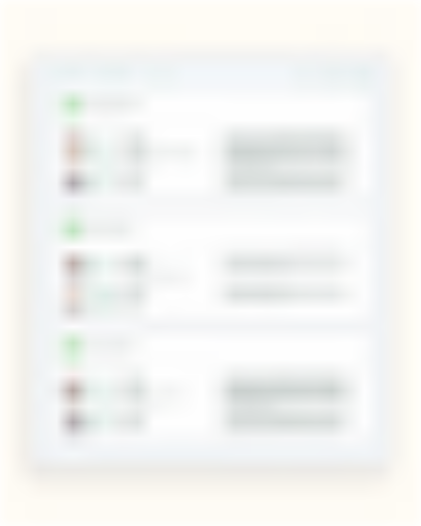
A little time later, we also designed a new customer hub for Workbooks, bringing the same sense of style to their customer help portal to make it quicker and simpler for customers to submit tickets and find more information.

The Mighty change

Ultimately, Workbooks’ development team couldn’t implement all of our ideas exactly, due to limitations in the software itself, but the overall result was still considerably cleaner and easier to use.

The company has been recognised by G2, one of the world’s most trusted B2B review sites, as a High Performer in the UK, US and EMEA, and can now stand up next to any of the big players as a powerful alternative.