New Work
Robyn Hardman 08.05.26 2min Read
Going green: a new logo for Gloucestershire Green Skills
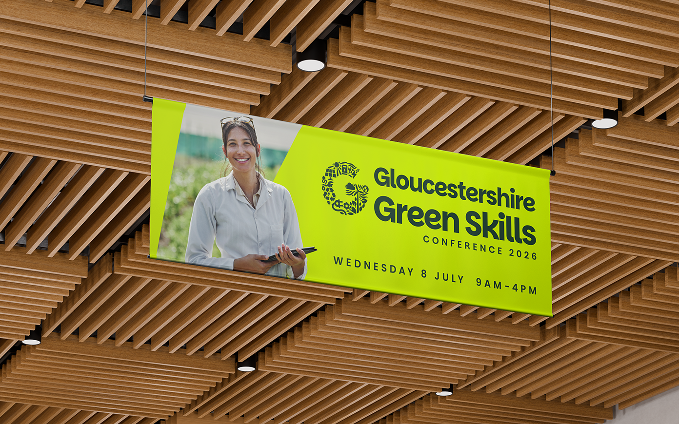
Gloucestershire County Council got in touch with us to see if we could create a logo they could use for their whole Green Skills initiative, as well as the upcoming conference, because they were looking for something that could stand apart from the council itself as the event grew. And of course, we said ‘yes, that sounds right up our street’ and immediately started putting Apple Pencil to iPad.
The thing is, the word ‘green’ in this context can be a bit overwhelming. It can mean a whole load of different things. Anything from organic veg and wind power to recycling and carbon capture. We came up with a few variations, but they all tended to centre around just one aspect, which wasn’t going to work.
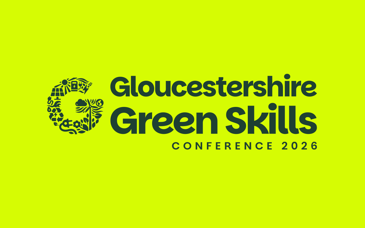
Our final version was a G made up of all sorts of different ‘green’ initiatives, like solar power, wind power, electric vehicles and more, all tied together with a leaf motif and a friendly font. We pulled out the G for green specifically, but crucially, G also stands for Gloucestershire, so the brand unites the county and its Net Zero mission.
We had fun playing with the colours on this one, trying to find something other than the boring ‘recycling’ green that’s standard everywhere on these events. Instead, we went for a bold lime juxtaposed with a deep pine, along with some stylish cream and blue options, too.
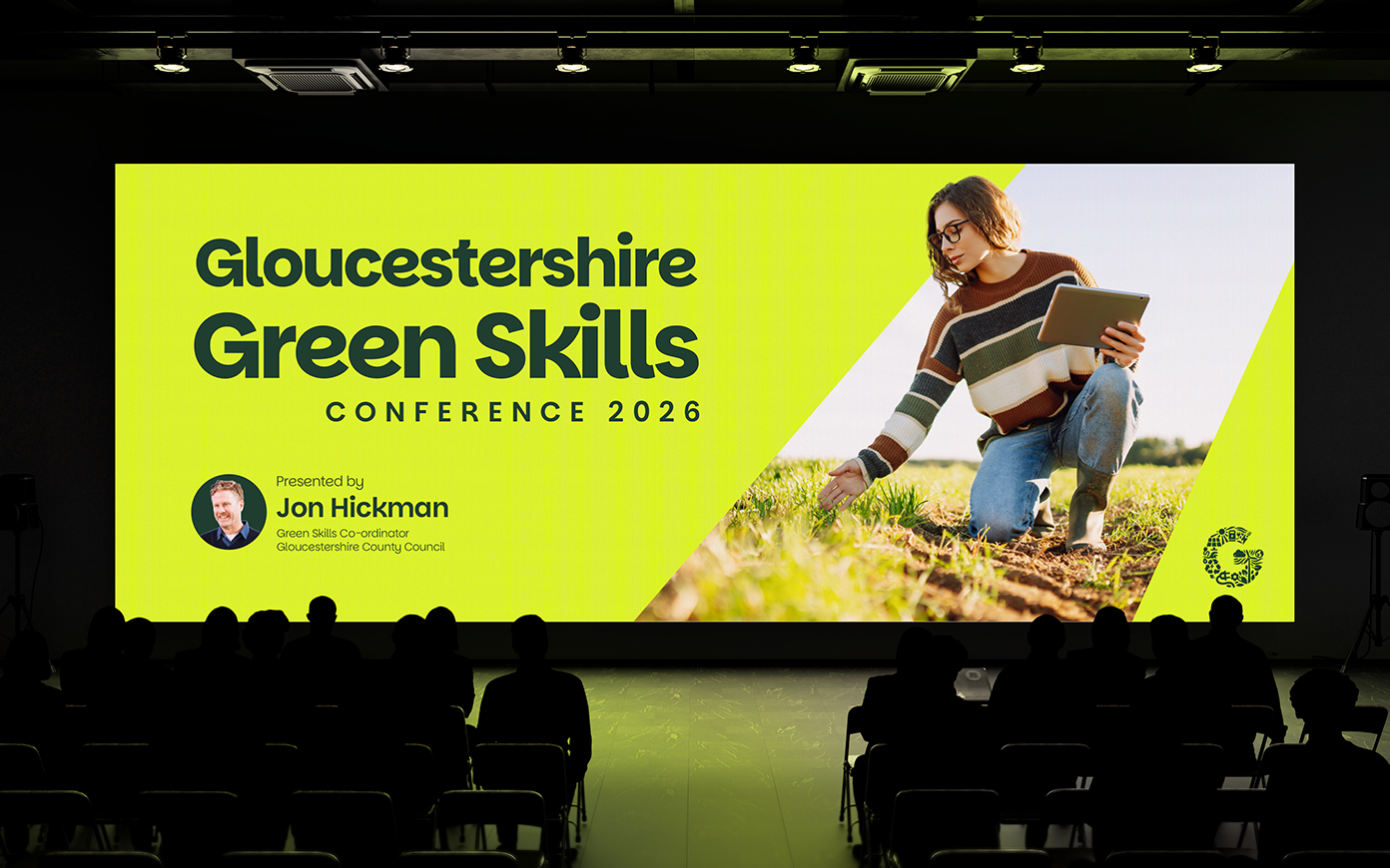
The conference itself takes place on Wednesday 8 July, where the council will be launching their new Green Skills Strategy. To join the conference, find out more at https://www.gloucestershire.gov.uk/business-property-and-economy/green-skills-conference-2026/